主题相关配置
布局方式预览
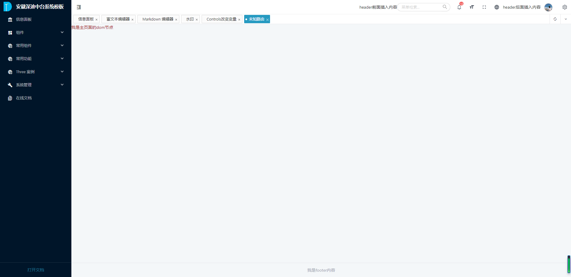
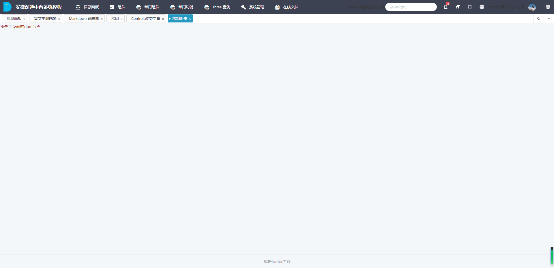
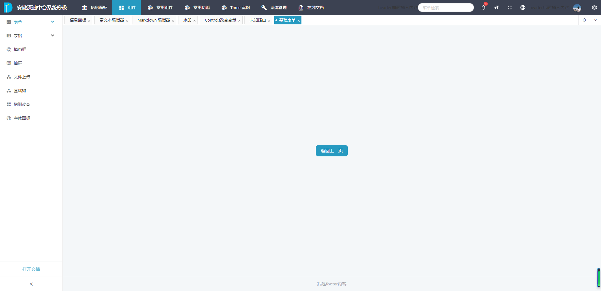
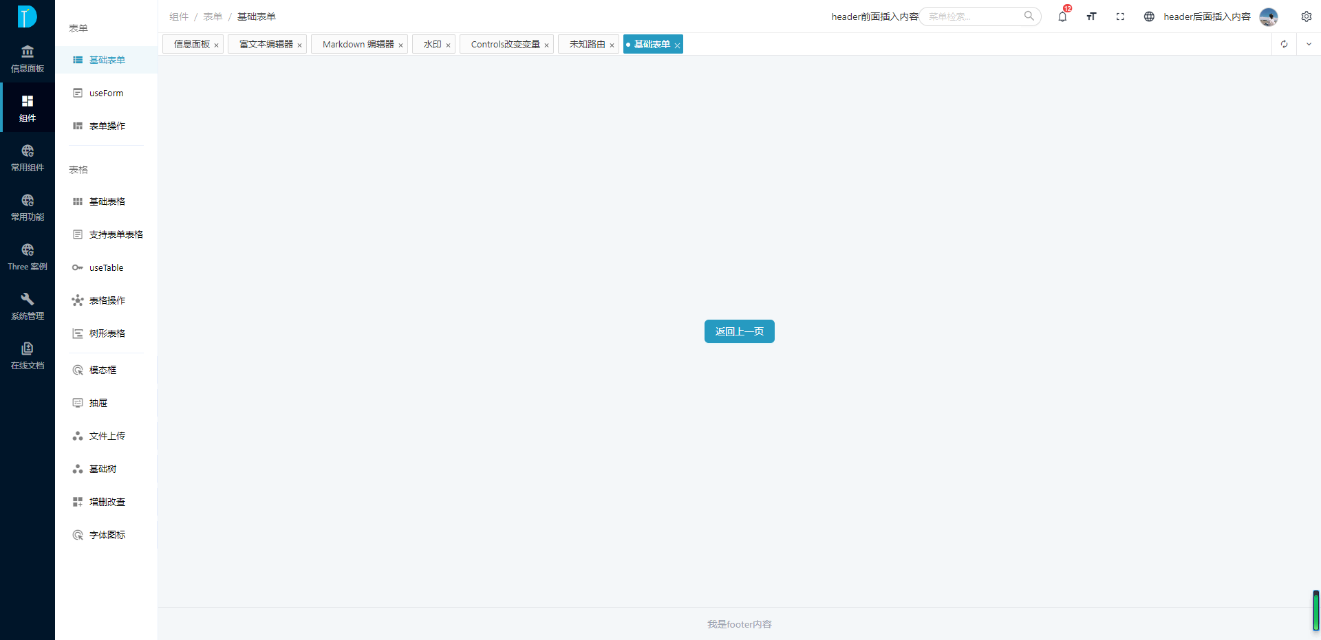
为了满足业务和品牌上多样化的功能需求,目前支持四种页面布局方式。
主题配置
本框架支持一定程度的功能定制,主要包括以下五个部分:
- 菜单配置:
MenuOptions - 头部配置:
HeadOptions - 路由配置:
RouteReuseOptions - 底部配置:
FooterOptions - 内容区域配置:
ContentOptions
在src/core/config/init.config.ts中的themeConf属性配置。
ts
{
    ...
    themeConf: {
        // 是否保存在缓存中, 默认为false
        cache?: boolean

        // 头部设置
        headOptions?: HeadOptions

        // 菜单设置
        menuOptions?: MenuOptions

        // 底部设置
        footerOptions?: FooterOptions

        // 路由复用
        routeReuse?: RouteReuseOptions

        // 内容区域
        content?: ContentOptions
    }
}具名插槽 slots
在框架开发中考虑到部分内容用户需要自己定制,所以留了一些插槽。下图中标出了插槽的名称:
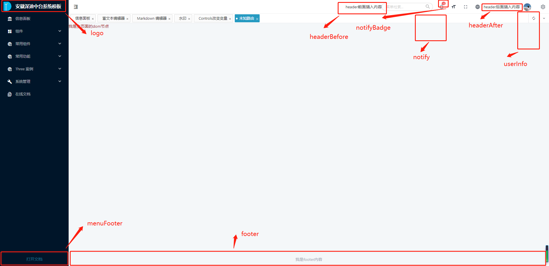
代码中具体的写法如下:
html
<template>
    <DtTheme>
        <!-- logo自定义 -->
        <teamplate #logo="data">
            我是菜单上面的logo
        </teamplate>

        <!-- 菜单底部的插槽 -->
        <teamplate #menuFooter="data">
            我是左侧菜单下面法律法规内容
        </teamplate>

        <!-- 通知公告消息数,右上角badge -->
        <teamplate #notifyBadge>
            12
        </teamplate>

        <!-- 通知公告弹框内容自定义 -->
        <teamplate #notify>
            <ATabs>
                <ATabPane tab="通知"></ATabPane>
                <ATabPane tab="代办"></ATabPane>
            </ATabs>
        </teamplate>

        <!-- 用户信息下拉数据自定义 -->
        <teamplate #userInfo>
            <div>修改密码</div>
            <div>用户信息</div>
        </teamplate>

        <!-- 头部前面插入内容 -->
        <template #headerBefore>
			<div>header前面插入内容</div>
		</template>

        <!-- 头部后面插入内容 -->
		<template #headerAfter>
			<div>header后面插入内容</div>
		</template>

        <!-- 设置头像 -->
        <teamplate #icon>
            <img src="xxxxx" />
        </teamplate>

        <!-- 设置footer -->
        <teamplate #footer>
            <div>我是footer内容</div>
        </teamplate>
    </DtTheme>
</template>

<script lang="ts" setup>

</script>API
路由配置 MenuOptions
| 属性 | 说明 | 类型 | 默认值 | 版本 |
|---|---|---|---|---|
| fixed | 菜单是否跟随页面滚动 | boolean | true | |
| theme | 主题 | Theme.Light Theme.Dark | Theme.Dark | |
| collapsed | 是否收缩菜单 | boolean | false | |
| canDrag | 是否支持拖拽改变菜单宽度 | boolean | true | |
| split | 分割菜单(紧混合模式支持) | boolean | false | |
| menuWidth | 菜单默认宽度 | number | 240 | |
| trigger | 是否显示菜单收缩控制按钮 | boolean | true | |
| type | 菜单类型 | 'sidebar' 'top-menu' 'mix' 'mix-sidebar' | 'sidebar' | |
| mode | 菜单模式 | 'inline' 'horizontal' 'vertical' | true | |
| mixSideTrigger | type为'mix-sidebar'模式是否支持悬浮切换菜单 | 'hover' | 'click' | 'hover' |
头部配置 HeadOptions
| 属性 | 说明 | 类型 | 默认值 | 版本 |
|---|---|---|---|---|
| fixed | 头部是否固定 | boolean | true | |
| theme | 主题 | Theme.Light | Theme.Dark | Theme.Light | |
| showLogo | 是否有logo | boolen | true | |
| showBackToTop | 内容区域出现滚动条时是否显示'回到顶部'按钮 | boolen | true | |
| useLockPage | 是否开启锁屏 | boolean | true | |
| size | 页面元素尺寸 | large | middle | small | 'small' | |
| showBreadCrumb | 是否展示面包屑 | boolean | true | |
| showFullScreen | 是否展示全屏按钮 | boolean | true | |
| showSearch | 是否展示菜单快速检索 | boolean | true | |
| showNotice | 通知消息 | boolean | true | |
| showLocaleSwitch | 语言切换 | boolean | true | |
| showLoginOut | 登出按钮 | boolean | true | |
| logoutClick | 登出按钮点击事件 | function | (() => {}) | |
| showSettingTheme | 主题设置 | boolean | true |
路由复用 RouteReuseOptions
| 属性 | 说明 | 类型 | 默认值 | 版本 |
|---|---|---|---|---|
| show | 是否显示路由复用 | boolean | true | |
| position | 路由复用显示的位置 | 'top' | 'normal' | 'normal' | |
| cache | 是否缓存 | boolean | false | |
| canDrag | 是否支持拖拽 | boolean | true | |
| showQuick | 是否显示快捷操作 | boolean | true | |
| showRedo | 是否显示刷新按钮 | boolean | true | |
| showFold | 更多操作 | boolean | true |
底部配置 FooterOptions
| 属性 | 说明 | 类型 | 默认值 | 版本 |
|---|---|---|---|---|
| show | footer是否显示 | boolean | true | |
| title | 标题 | string | 'xxx' | |
| subTitle | 子标题 | string | 'xxx' |
内容配置 ContentOptions
| 属性 | 说明 | 类型 | 默认值 | 版本 |
|---|---|---|---|---|
| contentMode | 内容区域是否使用定宽(类似于淘宝) | full fixed | 'full' |